
Tags
abstract, air, Alexander Calder, art work, bar, bathroom, circle, circle of life, communication, decor, decorating, design, earth, edges, effects, elements, emotion, emotions, expression, exterior, eyes, feng shui, fire, free form, geometric, interior, life, lines, lives, living, love triangle, peace, POOL, room, round table, Sabrina Alexis, see, seen, shape, shapes, soft, square, square one, style, Susan Lachance, triangle, triangular, visual, water, waves, wind, Winston Churchill, yang, yin, yinyang
Shaping Our Lives!!!

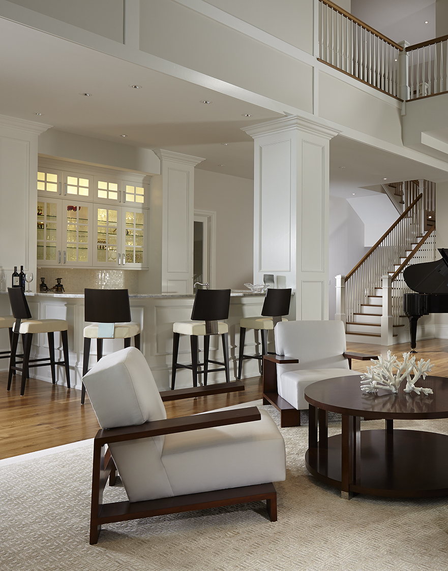
INTERIOR DESIGN BY: SUSAN LACHANCE INTERIOR DESIGN
“We Shape our buildings; therefore they shape us.” Winston Churchill
Shape Up:
Each day we are amongst many different shapes, which come in a variety of sizes and colors. Rarely do we even notice how every factor in our life has a shape and belongs in the category of shapes. From the furniture we choose to the decor we hang on our walls we are emotionally connecting with the shapes. The architecture of a structure comes to existence through shapes. These lines, curves, squiggles are all around us shaping us every day.
The building blocks and foundation of design is to clearly state visually. This means the visual effect is the personality of a given space. Shapes have an impact in ways that colors cannot. Not all shapes have boarders or are confined. Some are free –form blobs that are flowing. They come in come in all sizes and are not limited to being simple. Whereas, complex shapes derive from a combination of simple ones. Attributes of shapes are both positive and negative. They can also be attributed to being masculine and feminine. Yet are a neutral in part.

INTERIOR DESIGN BY: SUSAN LACHANCE INTERIOR DESIGN
Every shape communicates meaning and conveys emotion. These figures set the mood. Furniture and décor are shapes that fill a room. Our eyes present shapes that translate to feelings in our minds. Movement, texture, depth is produced by shapes, lines, curves, etc. Direct points of interest are enhanced and/or achieved by the “shape” in the given area.
Square One:
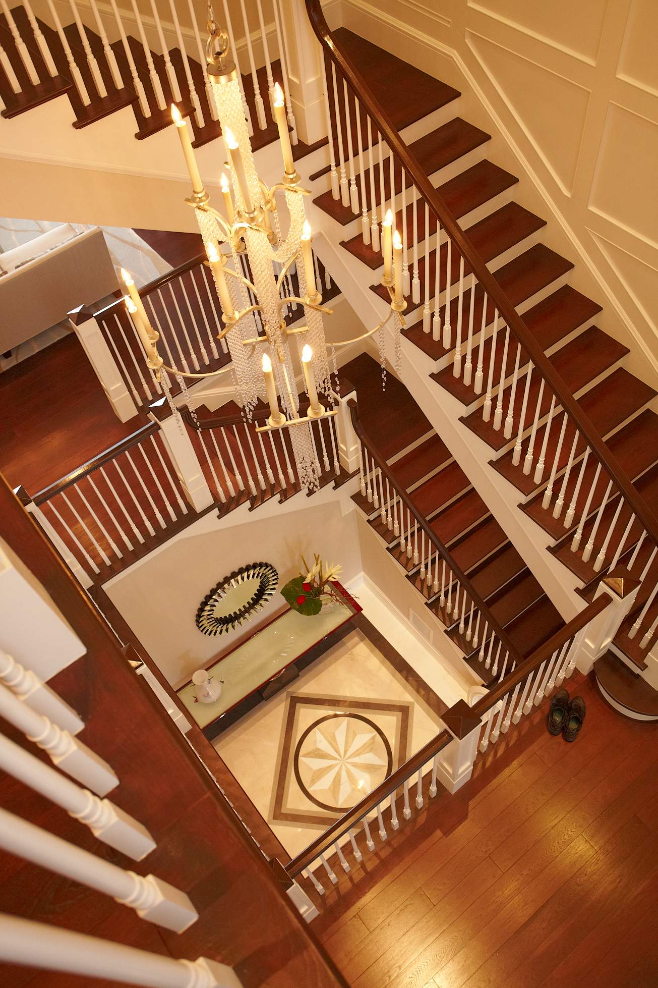
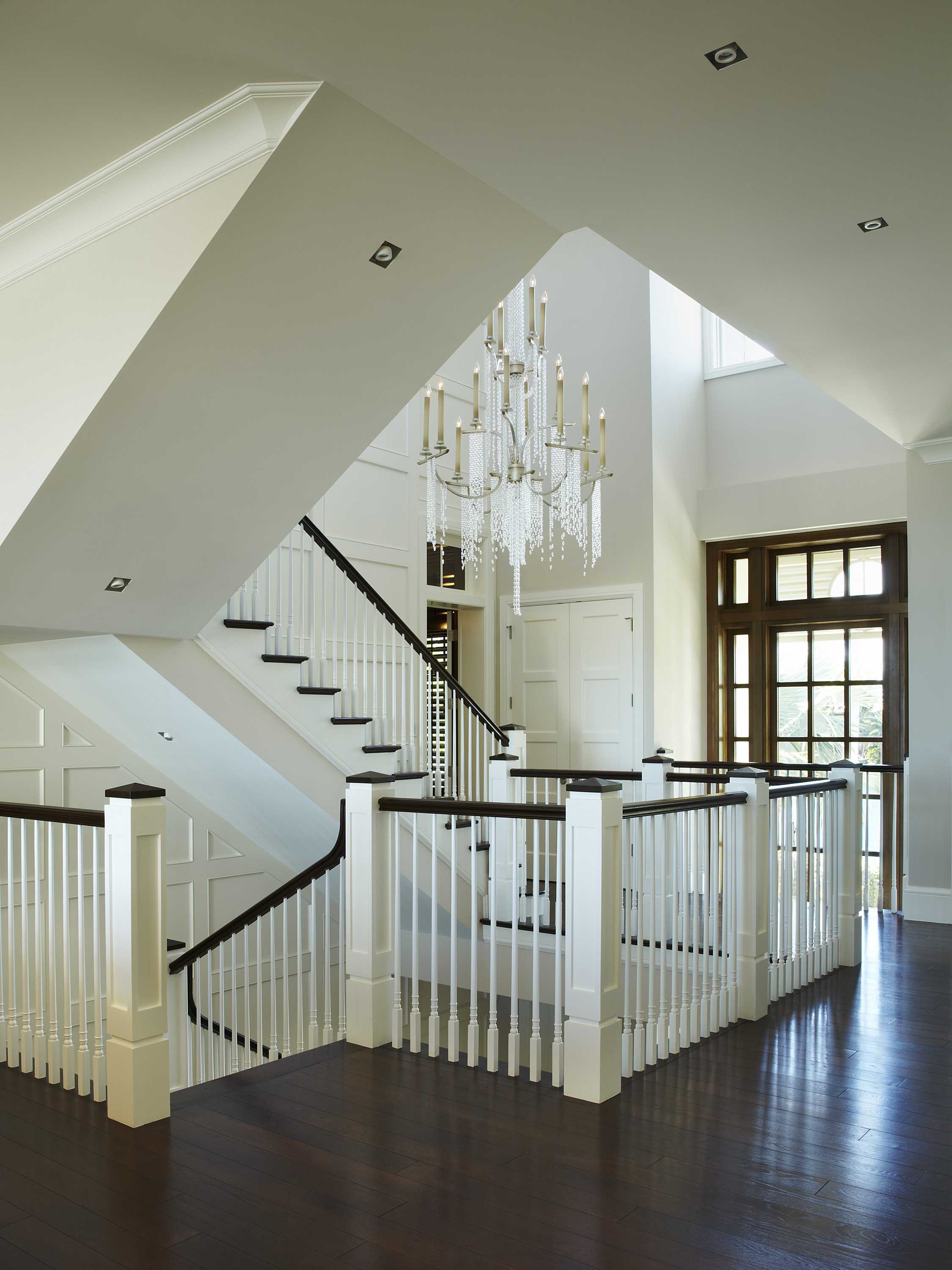
Squared with straight lines and edges produce a stabilizing effect to design. Hence, a feeling of home. The square is sturdy and stable. However, sometimes the opposite may be true as the straight lines could be viewed as harsh and too bold. The four lines connecting at ninety degree angles make it one of a kind. The square represents the four elements: fire, earth, water, and air. On the other hand when dealing with feng shui squares are part of the wood element.

INTERIOR DESIGN BY: SUSAN LACHANCE INTERIOR DESIGN
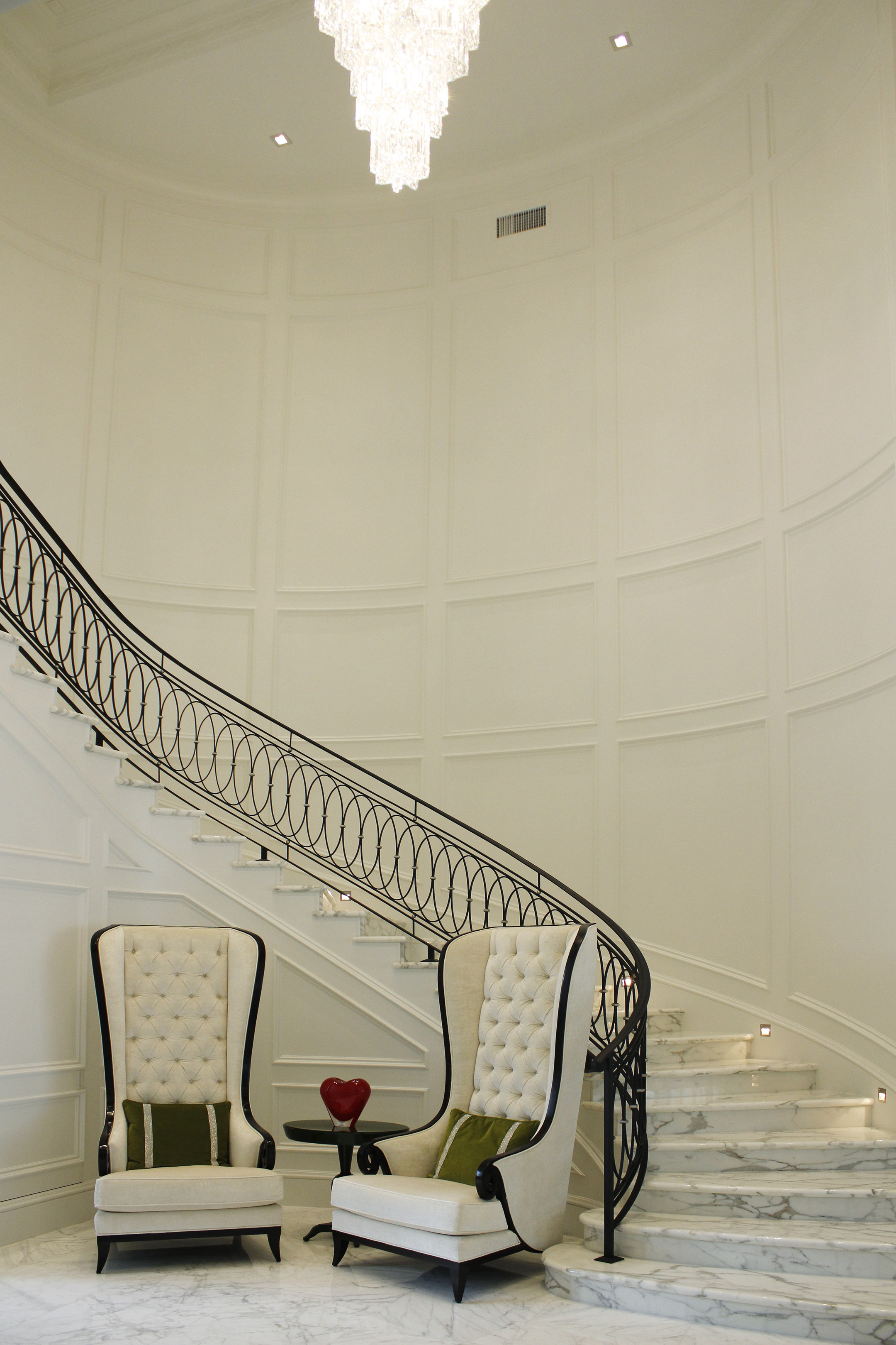
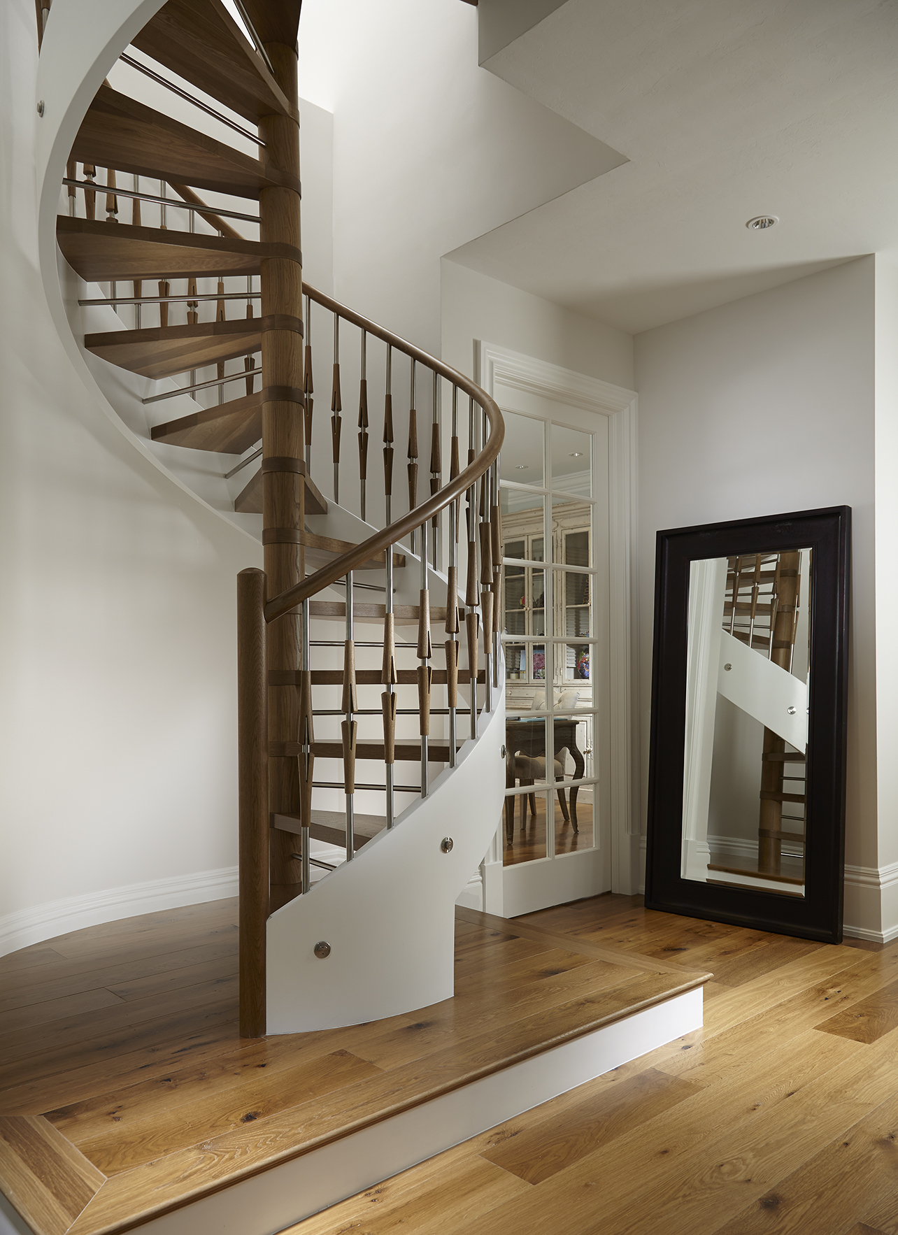
Circle of Life…Circling:
The circle has neither beginning nor an ending. It is round and promotes movement. A representation of a cycle, unity, a safety, a community, and a wholeness that is familiar. A round a round we go into a place of oneness, with boundaries. It denotes a separation with the solitude of peace. Two symbols that are signified in a circle are the peace sign and Yin Yang. In addition, the Yin Yang represents two opposites coexisting within one confined circle of peace.

INTERIOR DESIGN BY: SUSAN LACHANCE INTERIOR DESIGN
According to Feng Shui, “round” is an expression of the mental element. It conveys energy of clarity and freshness. Another example to refer to is the “Round Table”. Many designers and corporations suggest using round tables as it generates equality to the table and the members or people who be sitting around the table. Using this same theory interior designers do their best to create a circular seating arrangement when placing the furniture in living rooms as well as family rooms. This strategy promotes communication and insinuates equal conversation.
Love Triangle:
The triangle is a shape with many meanings that can be interpreted. The direction pointer of all the shapes. It’s strong when standing on its base pointing upward vertically showing an active Yang energy. When the point of the triangle is pointing downward, it has more of a passive Yin energy. No matter what the direction, the triangle is a set of three coming together at a point that corresponds to dynamic action. When applied with feng shui triangular shapes belong to the fire element. One way of applying feng shui with use of a triangular shape is through light fixtures that are shaped like stars.

INTERIOR DESIGN BY: SUSAN LACHANCE INTERIOR DESIGN
Free To Be:
Free of form and restriction creative “blobs” or unconventional straight lines in combination with curved ones are shapes that are abstract. These unique designs are flowing unraveling waves of adventure. They promote creativity and individuality. In addition they are the language to the vision giving communication without words. Abstract shapes such as curves are very fluid. Using them in your home signifies a water element which is graceful and flowing.
 INTERIOR DESIGN BY: SUSAN LACHANCE INTERIOR DESIGN
“I paint with shapes.” Alexander Calder
Now you’re in “shape” with a few “matters of facts” on the visual communication of design.
Stay Styled With Design,
Sabrina Alexis


")
")


") INTERIOR DESIGN BY: SUSAN LACHANCE INTERIOR DESIGN
INTERIOR DESIGN BY: SUSAN LACHANCE INTERIOR DESIGN")
 I
I


